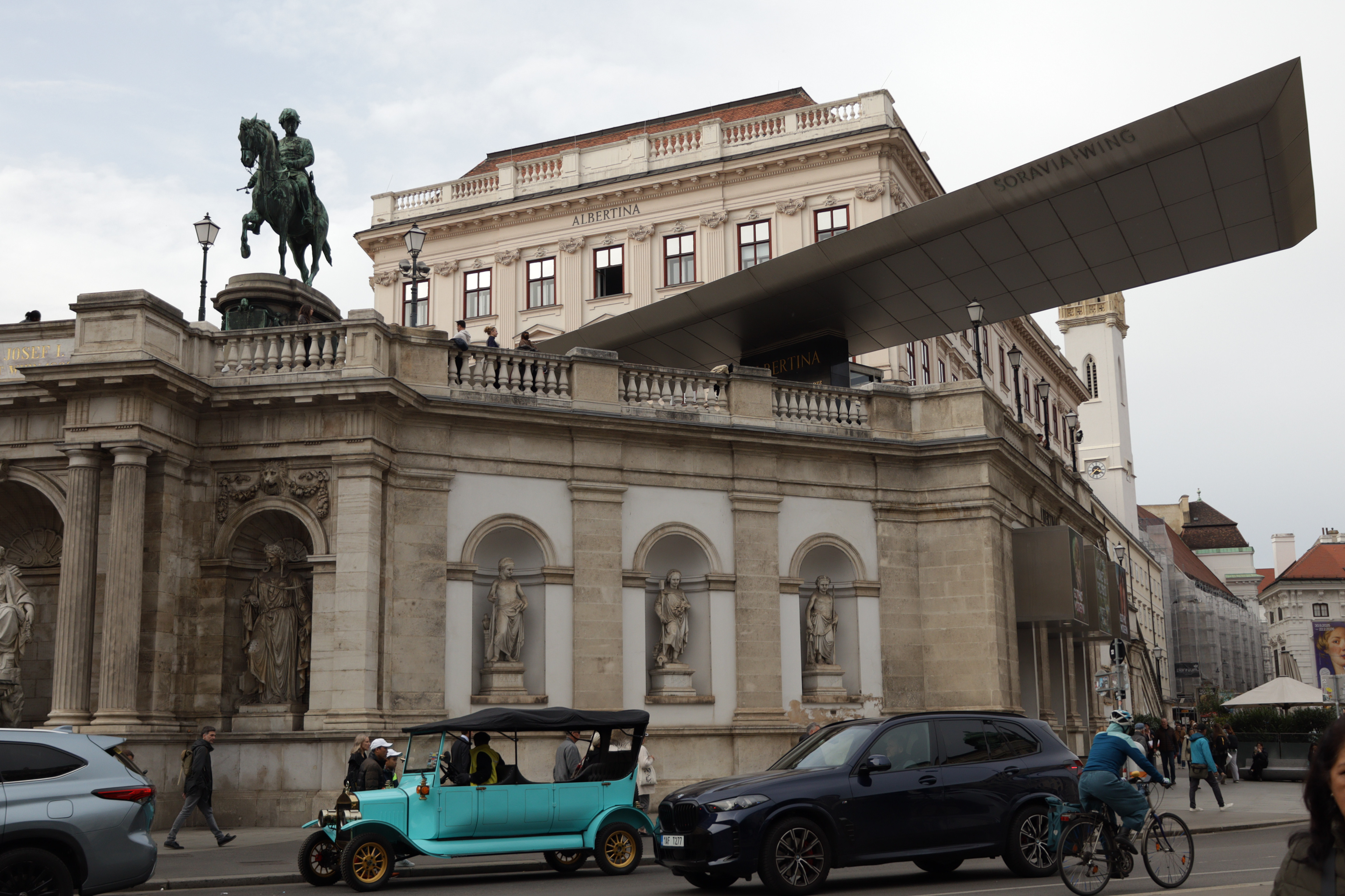
Looking at these two frames of the same scene—the raw, flat version and the edited, cinematic one—you can really see how post-processing changes not just the look of a photograph, but its entire mood and story. Straight out of the camera, the image of the Albertina and the equestrian statue is clean, properly exposed, and natural. The stone walls are beige and even, the sky is pale and featureless, and the turquoise car on the street feels like a quirky detail rather than a focal point. It’s a perfectly fine tourist snapshot, the kind of file you could drop straight into an archive, but it doesn’t really say much yet.
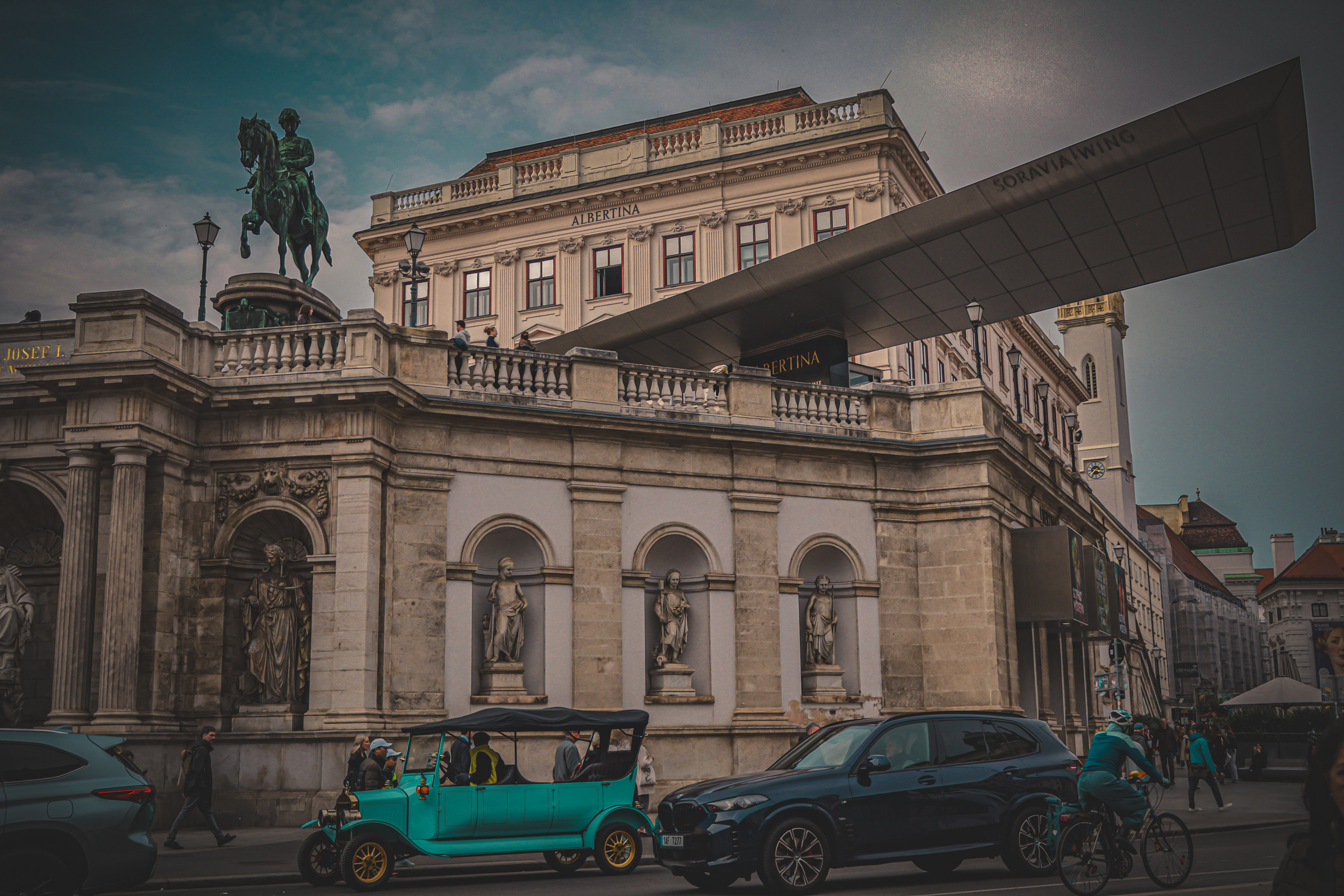
The edit pushes everything into a more dramatic register. Exposure has been pulled down, contrast bumped up, and the blacks deepened. Suddenly the stonework doesn’t just record light—it has weight and texture. The statues tucked into their alcoves stop blending into the background and instead look almost sculpted by spotlight. The once-washed-out sky now has mood, tinted with teal, as if it belongs to a film scene shot at dusk rather than an overcast afternoon. Clarity, texture, and probably a touch of dehaze give the image grit, pulling out details in both stone and clouds.
But it’s the color grading that does the heavy lifting. The edit leans into that teal-and-orange cinematic palette, shifting shadows cooler and midtones warmer. The effect is subtle on the stone but striking on the car—it glows an impossible turquoise, suddenly central to the frame. In the original, the car was simply present; in the edit, it’s the protagonist. Even the cyclist’s teal outfit pops more, as if by design, tying into the same palette. What was once a neutral Vienna street scene becomes a carefully constructed color story.
What stands out most is how the edit moves the image away from “documentation” and into “storytelling.” The original says, “This is the Albertina on a cloudy day.” The edit says, “Here is Vienna, cinematic and timeless, where history looms in stone above, while modern life rolls past in a teal antique car.” The shift is not about accuracy—it’s about mood. It exaggerates, it dramatizes, it stylizes, and in doing so it makes the scene memorable.
If you wanted, there’s a middle path too: an edit that lifts the flatness of the RAW without going quite so deep into cinematic territory. That would mean recovering some sky detail, nudging contrast, adding a hint of warmth to the stone, but stopping short of the teal-and-orange film look. It would preserve realism while giving a little more vitality than the untouched version. But the choice depends on intent—neutral edits for accuracy, cinematic edits for impact. Here, the impact clearly wins.