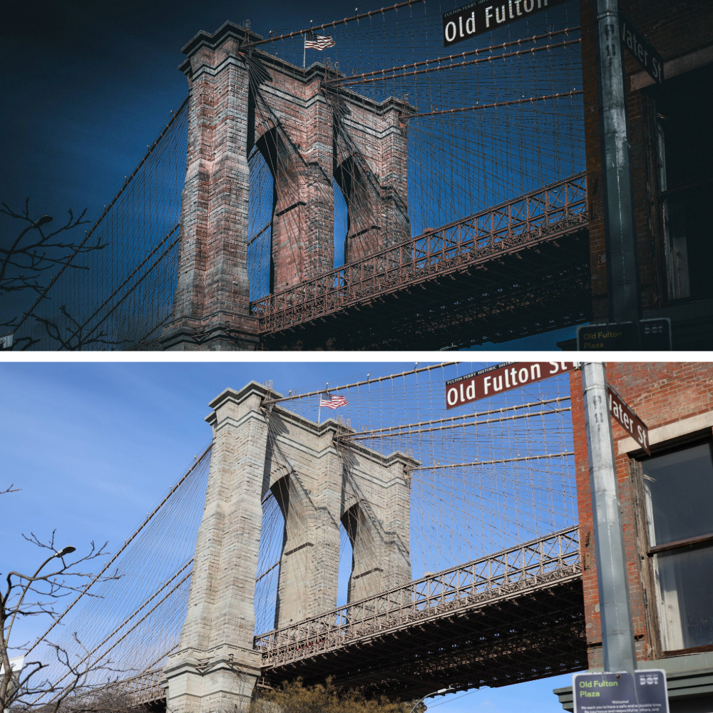
The collage flips the usual left-right comparison into a vertical conversation, and somehow that feels more honest for this scene. At the top, the post-processed image presses down with weight and atmosphere. The Brooklyn Bridge looks heavier, older, almost brooding, its stone towers darkened and textured until they feel less like architecture and more like geology. The sky has been pulled into a deep, moody blue, not dramatic for the sake of it, but dense, as if weather or time itself is gathering overhead. The cables carve sharp lines through that darkness, and the American flag becomes a small but stubborn accent, caught mid-motion. Even the edges seem to close in slightly, guiding the eye back toward the arches and the core of the structure. This version doesn’t just show the bridge, it leans into how imposing it feels when you’re standing beneath it on Old Fulton Street, neck tilted back, traffic humming somewhere out of frame.
Below it sits the original capture, calm and descriptive, almost breathing out after the intensity above. The sky opens up into a clean, honest blue, the stone reads lighter and more neutral, and the bridge settles back into its role as a landmark rather than a character. Details become informational again: the Old Fulton Street sign is clear, the brick building on the right edge feels anchored in everyday city life, and the plaza signage quietly explains where you are. This image is truthful in a documentary sense. It shows what was there, how the light actually fell, how the colors existed in that moment. Nothing is exaggerated, nothing is pushed, and that restraint is exactly why this frame matters. It’s the baseline, the raw sentence before interpretation begins.