Most visitors never see your full-size images. They see the grid. If the grid doesn’t work, the rest of the gallery might as well not exist.
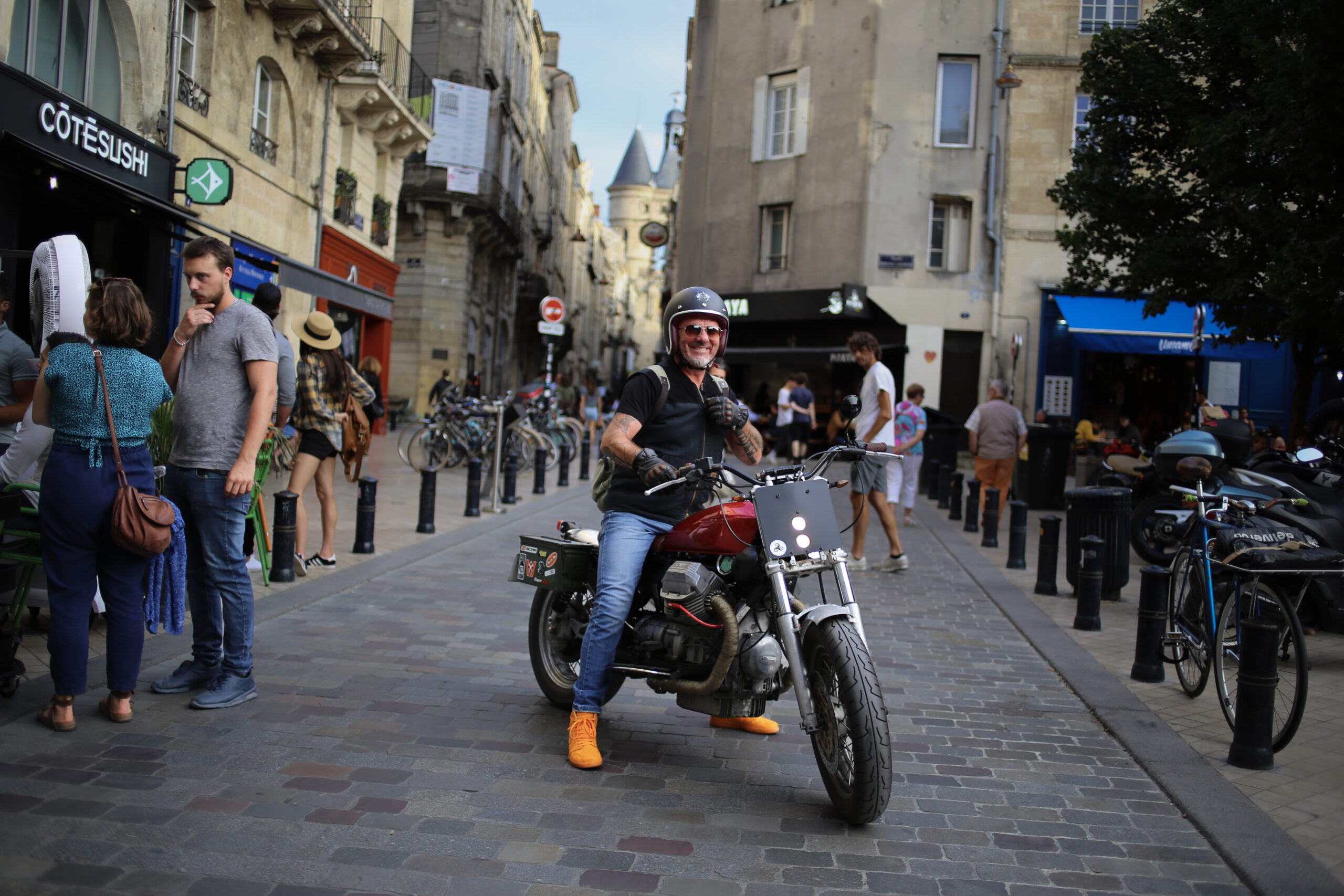
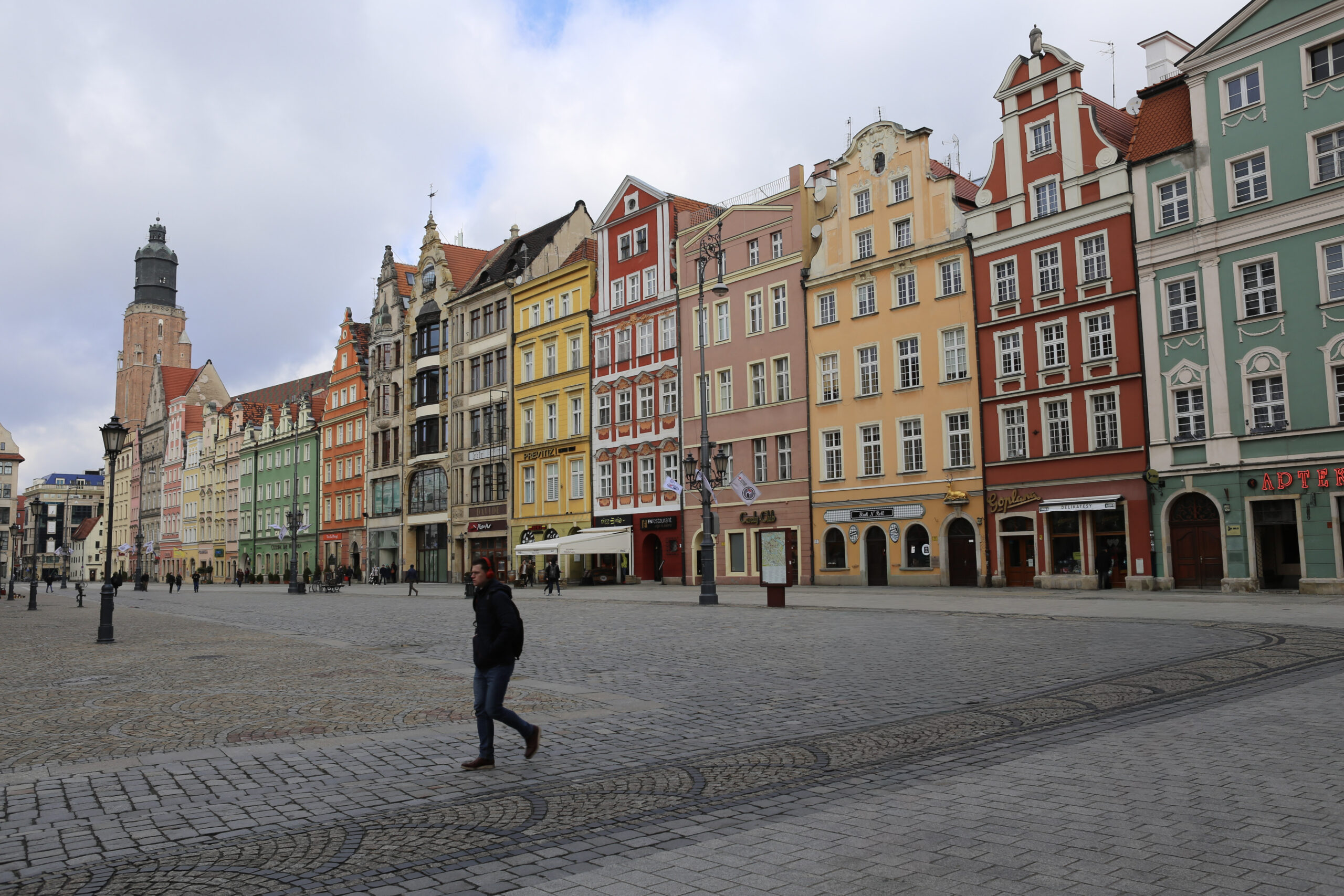
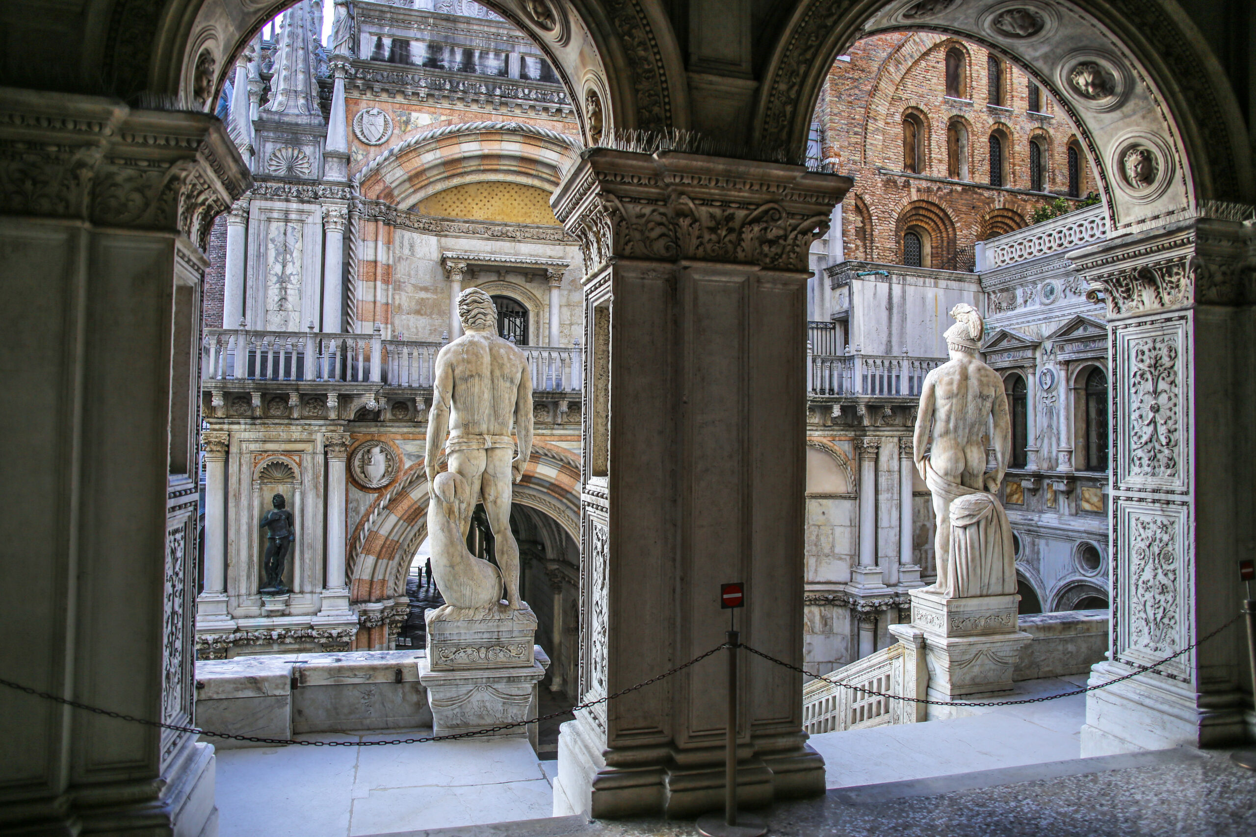
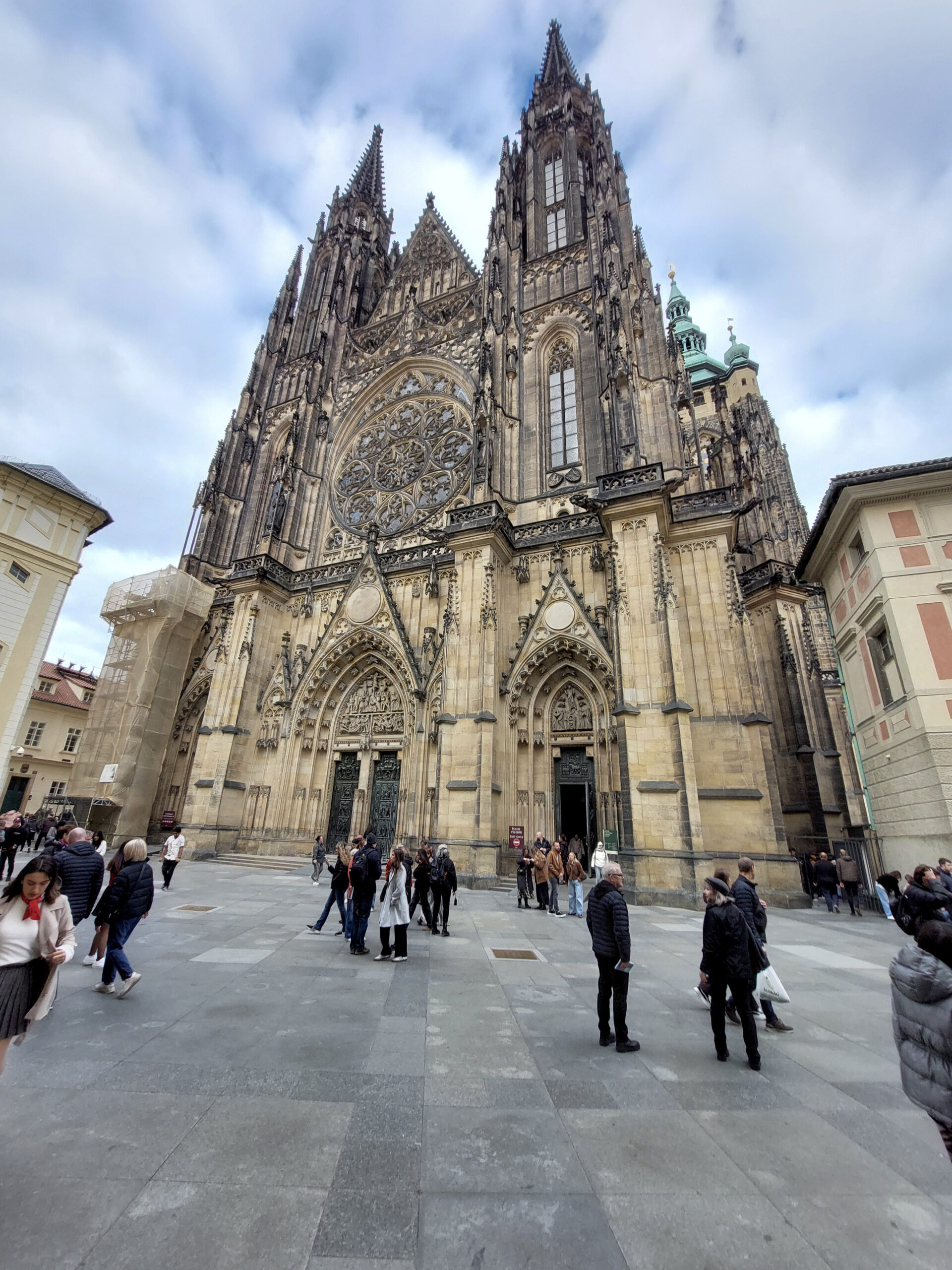
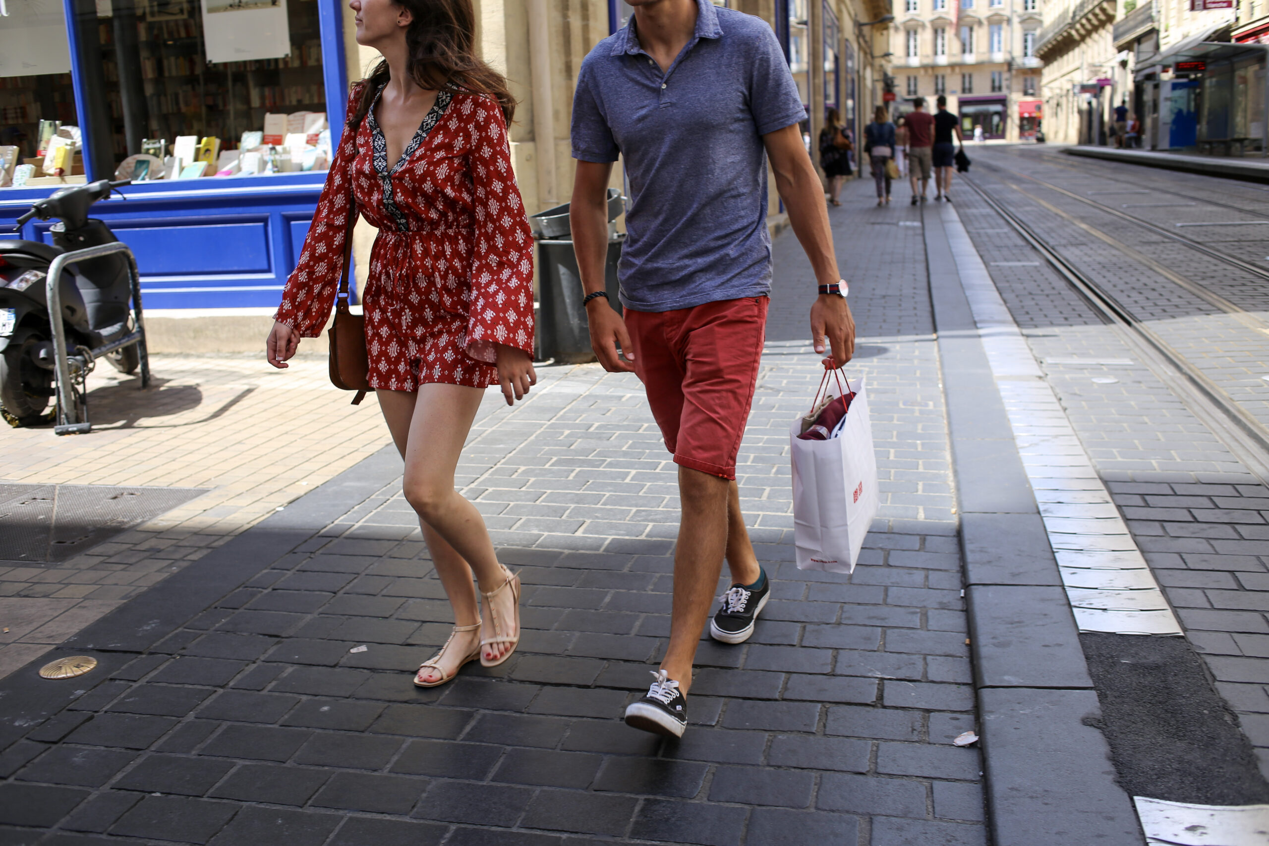

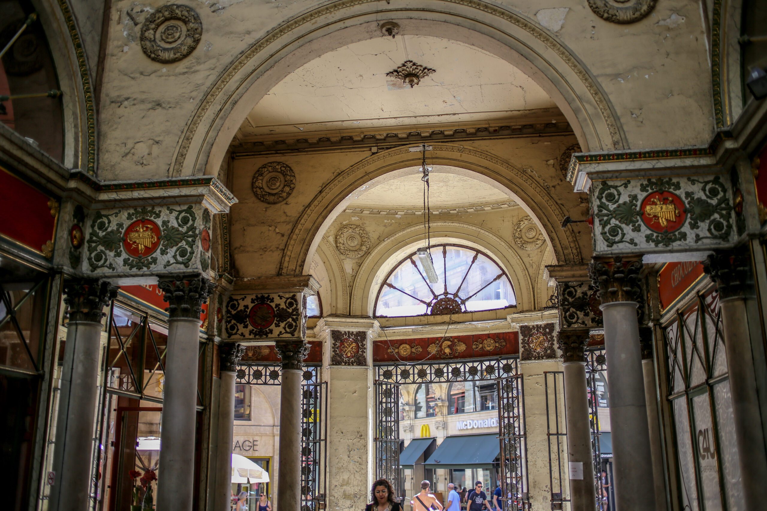

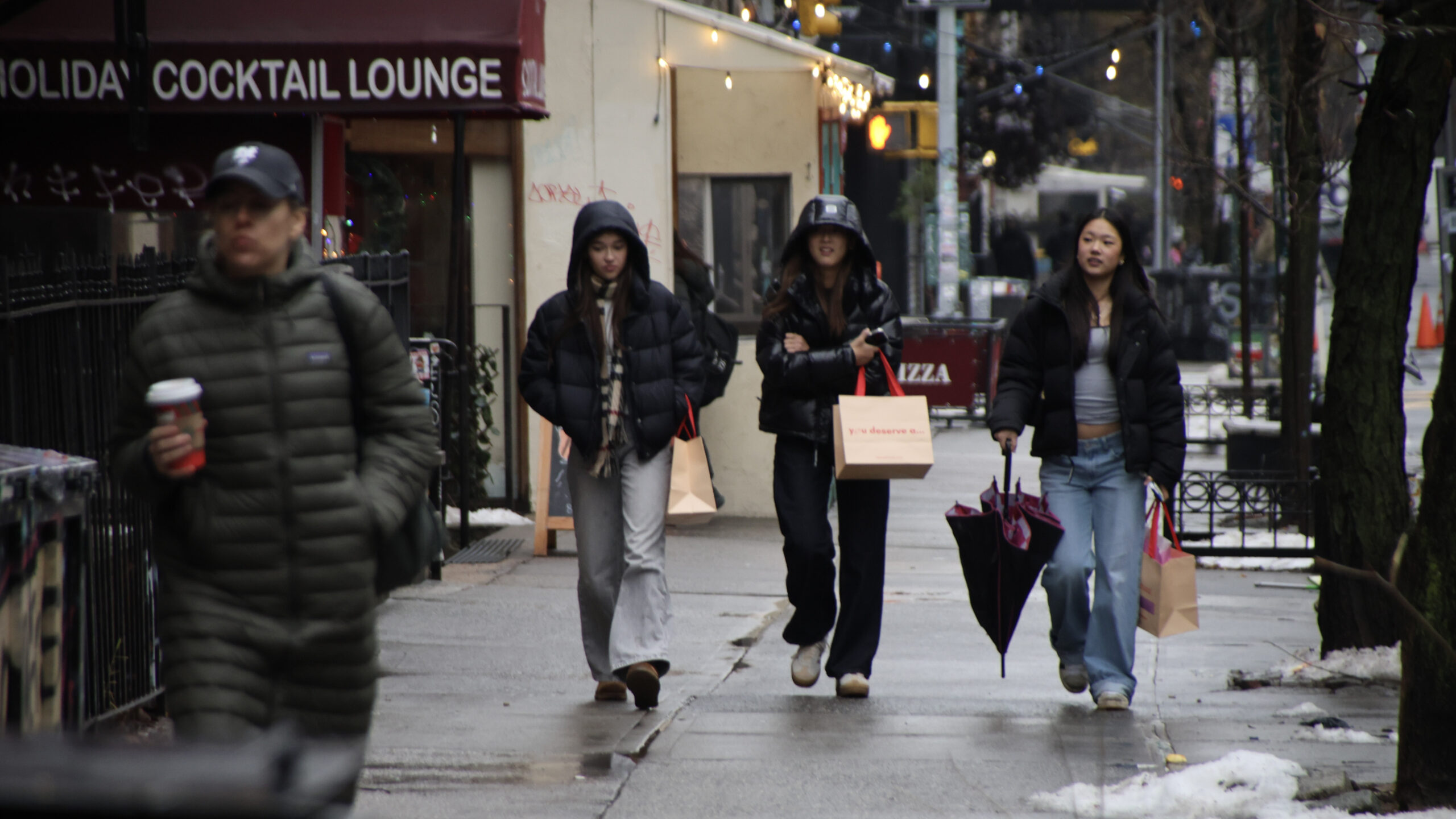
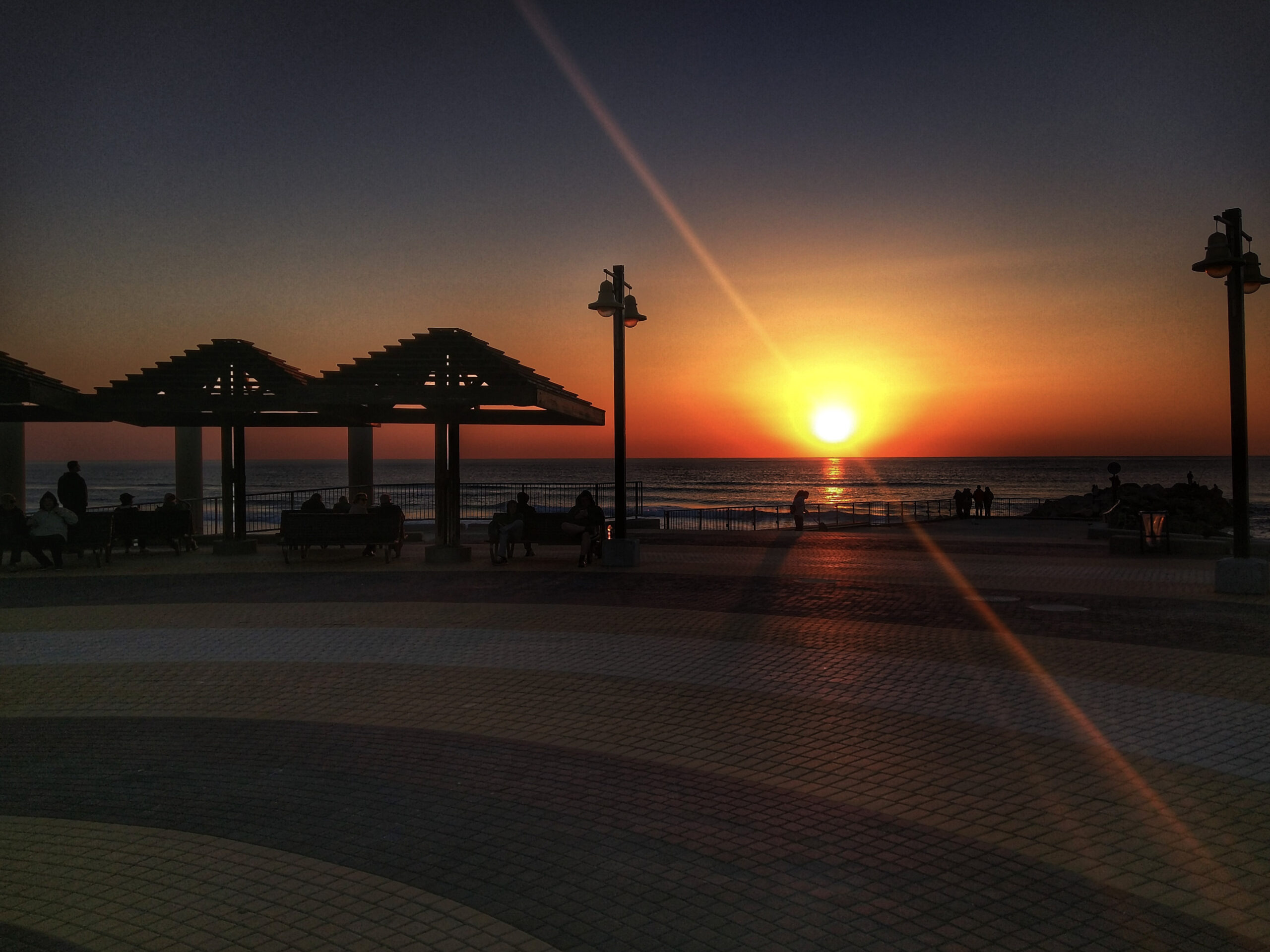
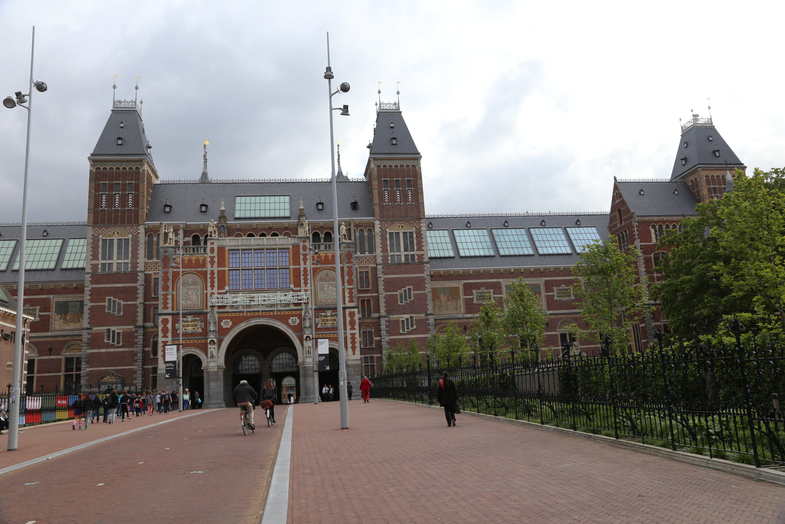
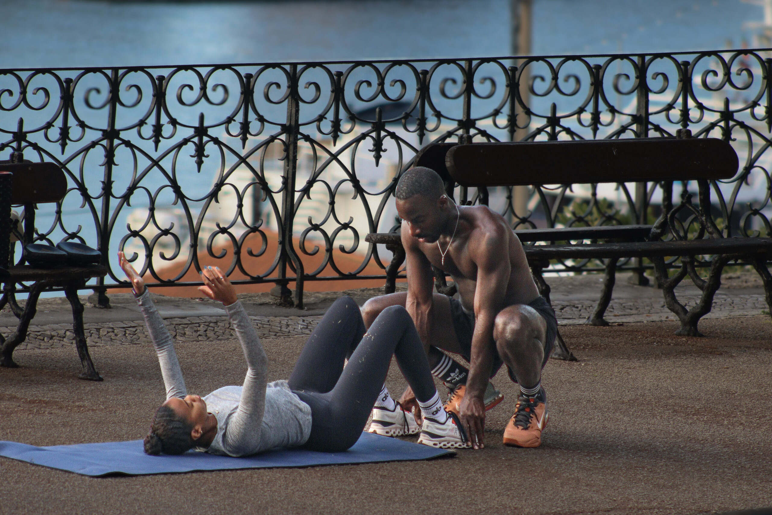
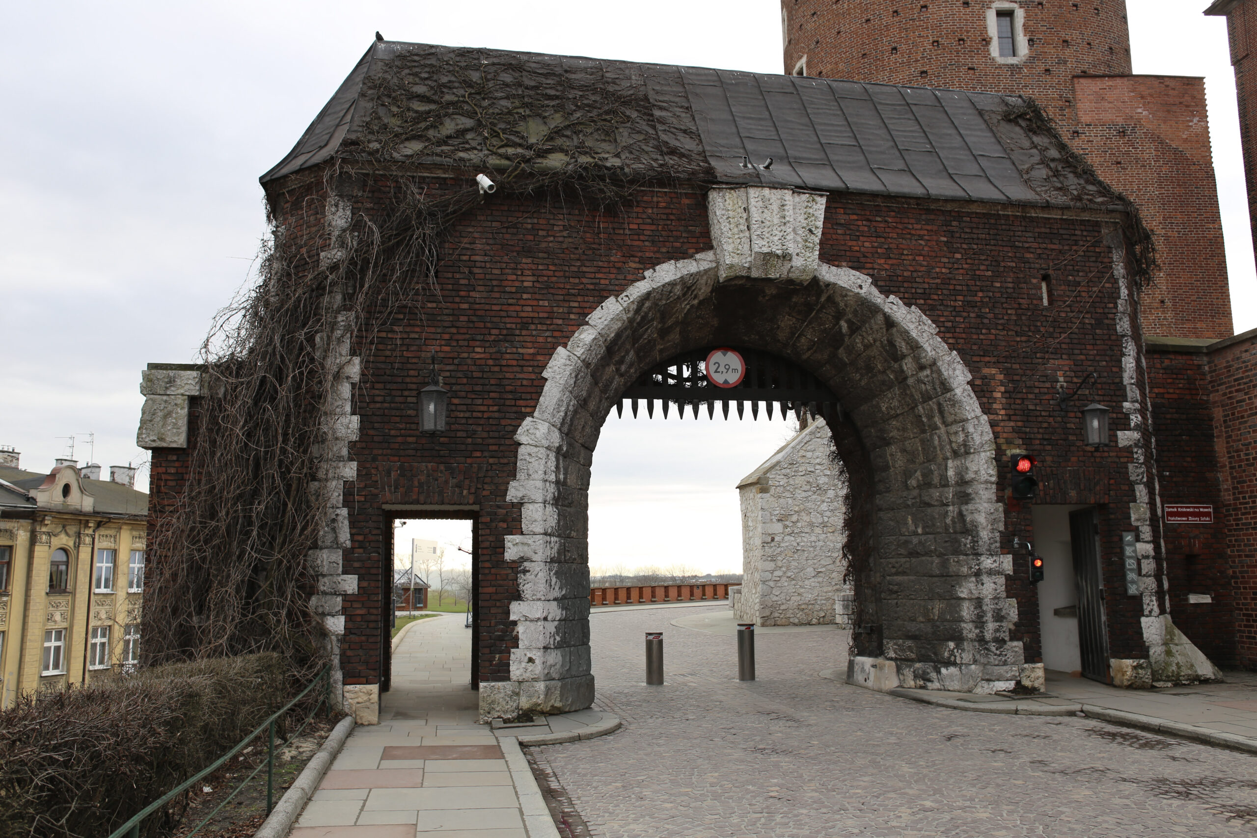

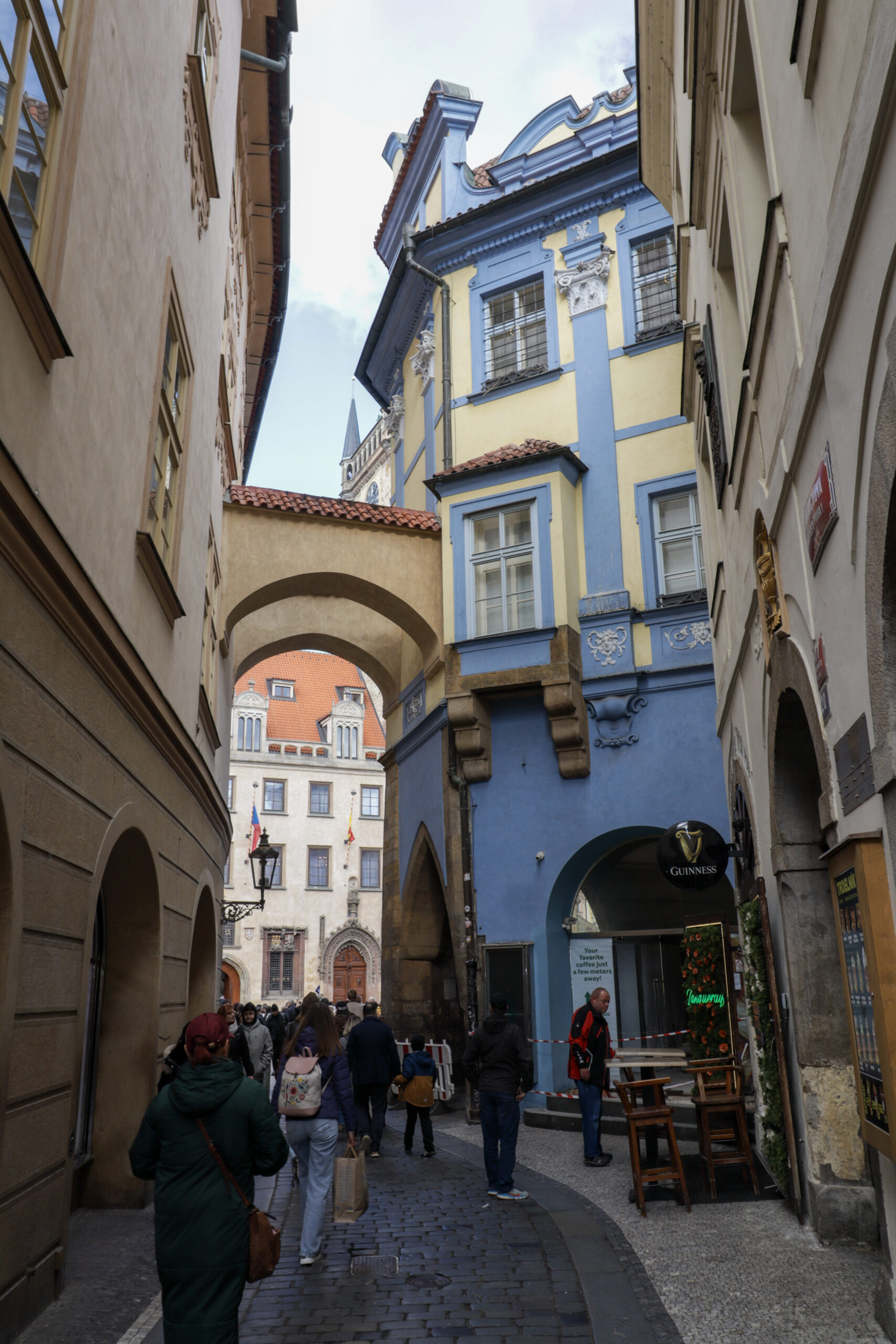

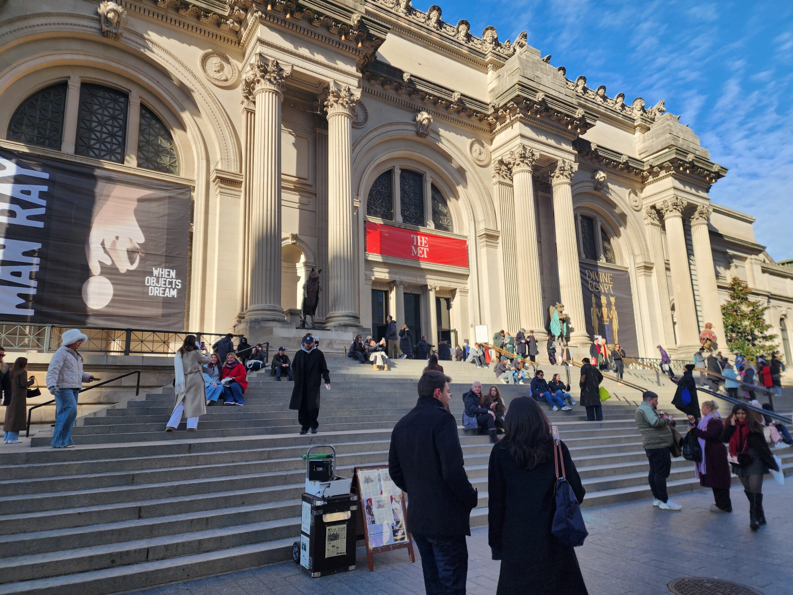
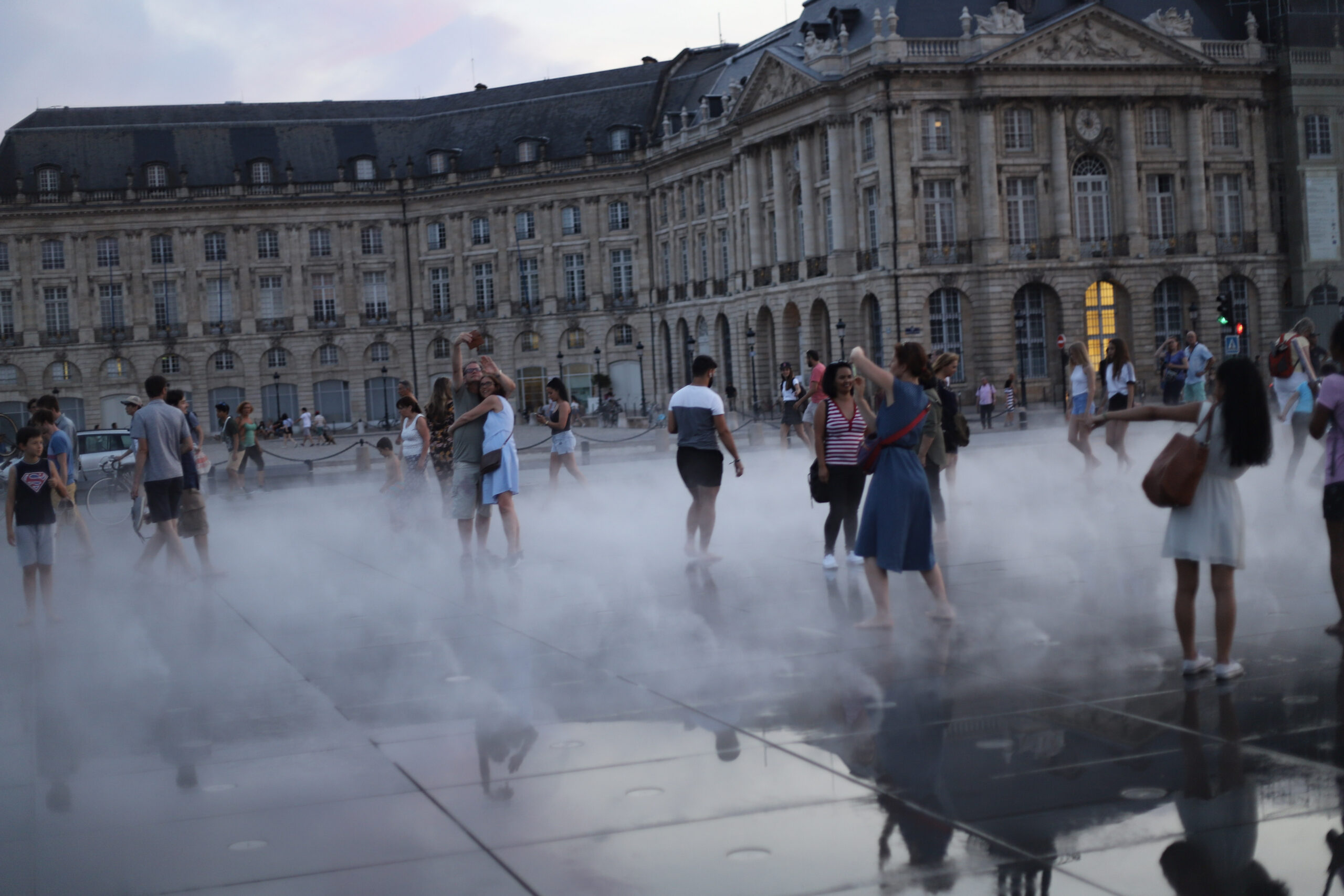
The first choice is uniform crops or original proportions. Uniform squares look tidy, and they’re easy to build. They also cut off heads, horizons and the details that make a photo interesting. A masonry layout keeps each image’s real shape and packs them together, which looks less rigid and respects the work.
Details that matter
Leave enough space between images that they don’t blur into one block. Load thumbnails lazily so the page opens fast, and reserve the space for each one so nothing jumps around as pictures arrive.
Don’t hide captions behind a hover effect. Phones don’t hover, and half your visitors are on phones. Show the title, or at least a short line, where people can see it without doing anything.
Order is a decision
Chronological order is easy. It’s rarely the best. Put strong images at the top, and mix subjects so the eye has something new every few rows. Think of it as a sequence a person walks through.
Then check the grid on your worst screen. If it works there, it works everywhere.