The most difficult part of making a travel media gallery often happens after the journey, when every photograph has a small private argument for staying. This was the first morning. That was the place where we stopped for coffee. The light on this wall really was lovely, even if six other frames prove the same thing. Those memories deserve somewhere to live, but a public collection needs to offer a stranger a way in. I would start with a simple question: what experience of this place can these pictures give someone who was not there? Two photographs of Prague suggest one possible answer: the pleasure of looking up at a city, then finding your way back into its streets.
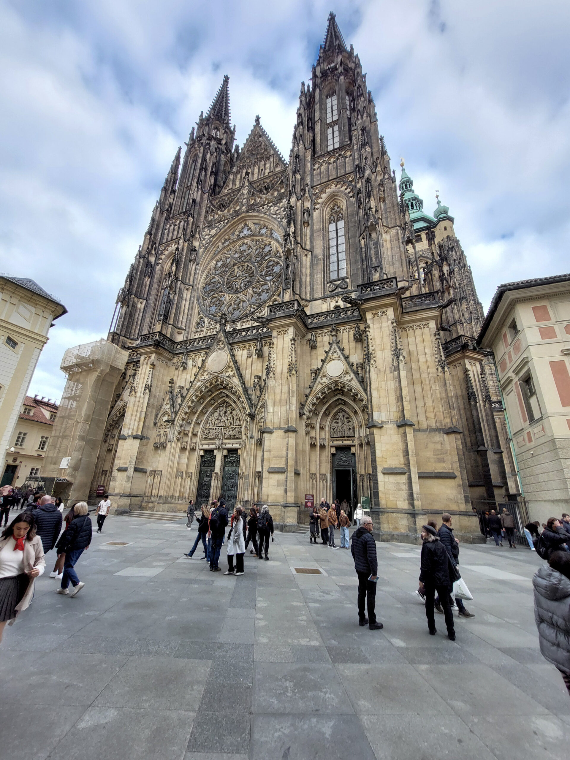
The first view is emphatically upward. St Vitus Cathedral rises above the people scattered across the paving, its twin western towers pointing into a blue-and-white sky. A large rose window sits within a dense arrangement of carved stone, pointed arches, tracery and figures. Warm pale surfaces give way to darker weathered sections higher up. At the right, a green-patinated tower appears behind the main facade; at the left, a section of scaffolding interrupts the architectural display. Visitors occupy the lower part of the frame in coats and jackets. Some stand talking, others walk, and a woman at the left looks down while the building demands that we look up. I like that competing attention. A major sight can be overwhelming without overwhelming every person standing in front of it.
As an opening image, this photograph establishes scale and gives the collection a recognisable place to begin. It also establishes an attitude: the people and scaffolding have been allowed to remain. I would keep them. They make this a view of a building being visited and maintained, with ordinary activity continuing at its feet. There are good reasons to make a clean architectural study, but a travel gallery can benefit from evidence that the place was shared with other people. Waiting for every stranger to leave a popular square may become a retirement project.
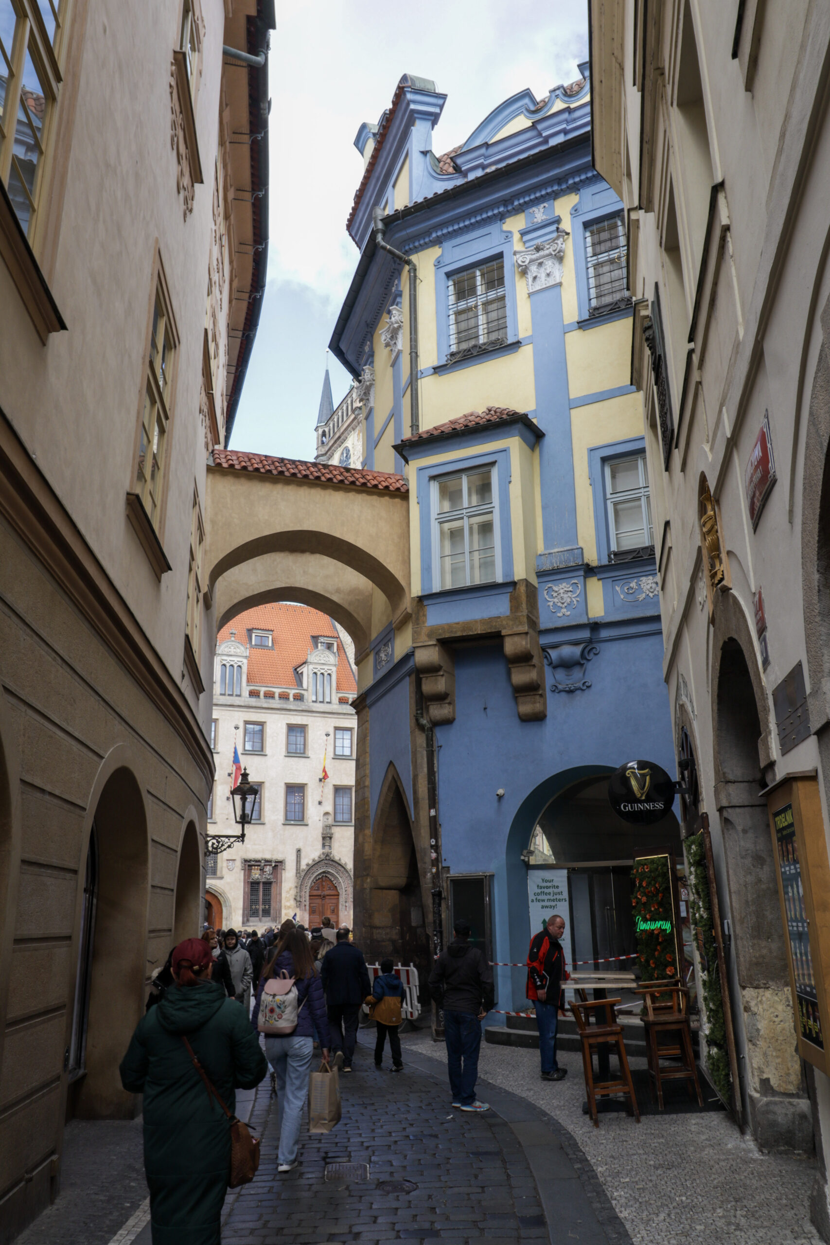
The second photograph changes the distance and the rhythm. A narrow cobbled lane bends between high walls towards an arch linking the buildings overhead. Beyond it, a pale facade with a steep orange roof, decorative window surrounds and flags closes the view. Closer to us, a yellow building is outlined with broad blue bands, its upper windows protected by metal grilles and its wall decorated with pale sculptural details. The blue continues down to an arched entrance. On the right, a black Guinness sign projects over wooden outdoor tables and stools; a strip of red-and-white tape crosses part of the frontage. Pedestrians fill the passage below. An old-fashioned wall lamp hangs at the left. This picture makes me want to walk forward rather than crane my neck.
Together, the two frames offer a change from monument to passage, from an expansive frontage to a space that funnels people between buildings. They do not prove a particular walking route, and I would not caption them as consecutive moments without knowing that they were. Their relationship is visual and editorial. One gives the city height and ceremony; the other brings it closer to shoulder level, even though both invite an upward glance. A travel sequence can move through ideas as well as streets, provided it is honest about which kind of movement it is making.
That is why I would choose a theme before choosing a final number of photographs. “Looking up in Prague” could hold these two images and other suitable frames if they were available. “A day in Prague” would require confidence about the dates and order. “Prague’s architecture” is broader and might call for more range than a short personal selection can provide. The title should fit the collection you can actually assemble. A small, specific promise gives you a useful basis for editing: the next photograph either develops it or asks the viewer to start following something else.
After an opening view, look for a change that rewards continuing. It could be distance, colour, activity, light or scale. A close view of a carved figure would let the eye rest on something the cathedral photograph can only suggest. A street scene could introduce daily activity. A quiet interior might shift the mood altogether. Those are possibilities, not a compulsory shot list. The danger of prescribing a wide view, a portrait, a detail and a sunset for every trip is that every destination begins to receive the same treatment. Work with what you noticed. The slightly peculiar photograph you cannot stop thinking about may give the gallery more character than another competent landmark view.
Then examine repetition. Two images of the same subject can justify their place when the second changes what we understand: a square before and during an event, for example, or a building seen from outside and within. Two nearly identical exposures usually ask the visitor to make the selection you have postponed. I would compare them at the size they will appear on the page, choose the stronger one and keep the alternative in the archive. If a pair genuinely rewards comparison, present it as a pair and explain the relevant difference. Otherwise, the reader has little reason to study your indecision.
Captions should supply the information a travelling companion would otherwise have to ask for. Name a place accurately. Give a date when it matters and is known. Explain an unusual circumstance if you can substantiate it. The street photograph offers plenty of visible detail to discuss, but it does not establish why the tape was there or what the man beside it was doing. A caption can be engaging without turning a passing person into a fictional character. Personal writing works best when the opinion belongs clearly to the writer: I can say the Guinness sign makes me smile beside the ornate facade. I cannot say what it meant to the people walking past.
If you have video or sound, give it a specific role. A recording could reveal bells, footsteps or a street performance that still images cannot convey. A short clip could show how a crowded passage moves. But a familiar soundtrack added afterwards would be a different editorial choice from sound recorded at the location, and the page should make that clear. For this collection, the photographs already establish an effective contrast. I would add another format only if the actual recording contributed something worth the interruption. Our comparison of media galleries and photo galleries explores that decision in more detail.
Presentation should preserve the relationships you selected. Both Prague photographs are vertical, and their height matters: the cathedral climbs, while the lane compresses buildings and pedestrians into a tall, narrow view. Square previews would lose some of that effect. An editorial layout with full images and text between them lets the reader experience each frame before moving on. A larger collection might benefit from an overview as well. The practical trade-offs are covered in our guide to media gallery layouts. Choose a format that makes the photographs easier to examine, then check it on the screen people will actually use.
End where the collection feels complete, which may be earlier than your upload folder suggests. The lane could close a short sequence by leaving the reader with somewhere to go; another gallery might finish on a quiet detail rather than a grand view. I would resist attaching a sunset merely because endings are supposed to glow. These two Prague pictures already offer a satisfying small movement: arrive before an extraordinary facade, then slip into a passage where blue paint, a pub sign, pedestrians and cobbles compete for attention. A travel media gallery begins to feel personal when the selection shows what held your eye. Give that curiosity a shape, and leave a little room for someone else’s.