The difference between a media gallery and a photo gallery is mostly a question of what the collection can contain. A photo gallery presents still photographs. A media gallery can bring together photographs, video, audio and, depending on the website, supporting files such as documents. In practice, the names overlap: a page called “Media Gallery” may contain nothing but pictures. Neither label guarantees a particular layout or set of features. I would choose the name according to what a visitor will actually find, then spend considerably more time choosing the material. Nobody has ever forgiven a dull collection because its navigation label was technically impeccable.
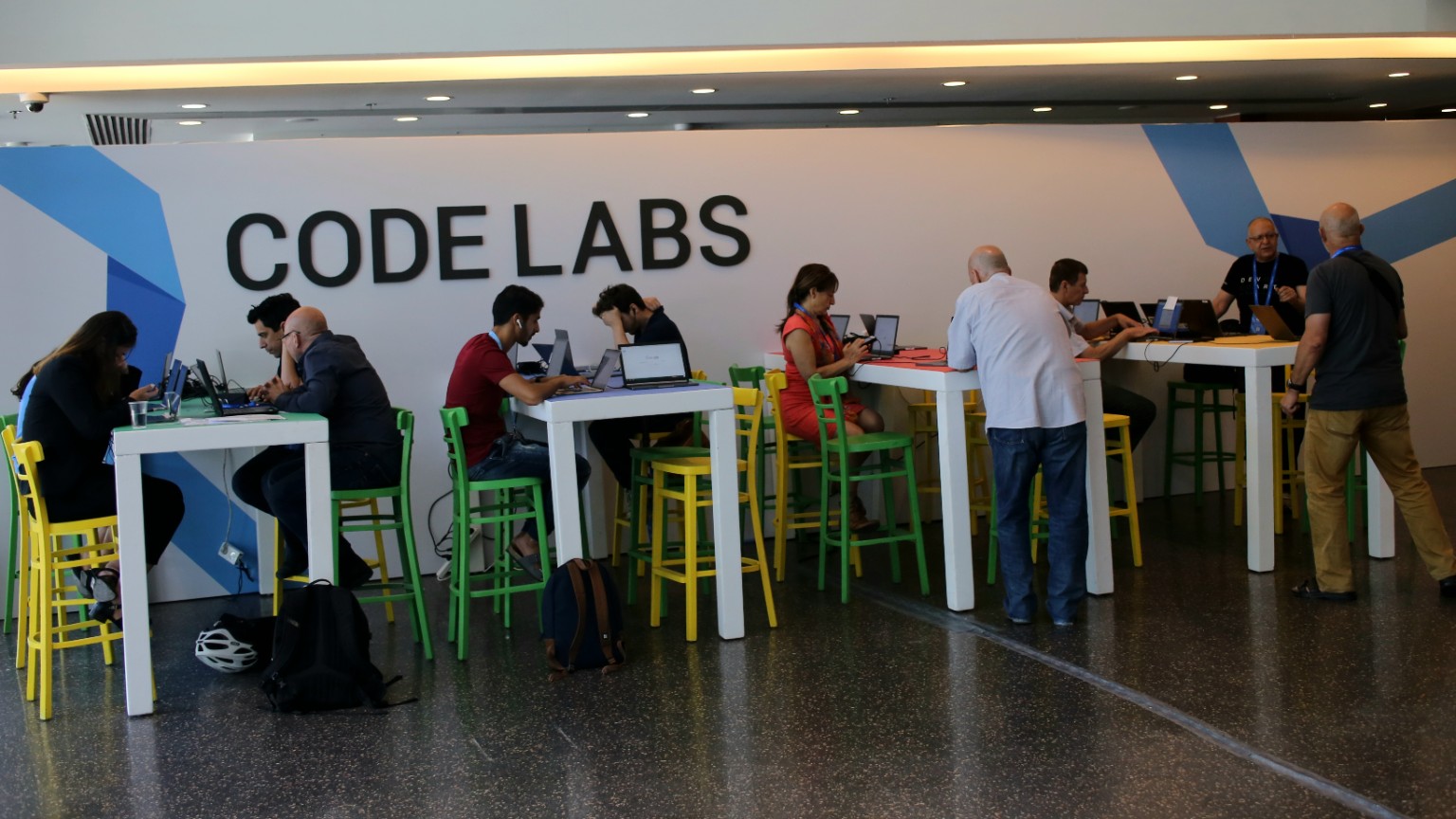
Take this photograph of a code lab. Oversized black letters stretch across a pale wall decorated with broad blue angular shapes. Beneath them, people occupy tall white tables with coloured work surfaces, surrounded by green and yellow stools. Open laptops, cables and a paper cup interrupt the clean geometry. At the left, a woman bends towards a device while two men concentrate on a nearby screen. In the middle, a man in a red shirt leans into his laptop; farther along, a woman in a red dress looks down at something in her hands. A man in a pale shirt stands with his back to the camera, and a small group gathers at the right. On the dark, speckled floor sit backpacks and a white bicycle helmet. Warm ceiling light runs above the scene. There is enough visual order to make the room legible, and enough ordinary clutter to suggest that people are actually using it. I find the helmet particularly reassuring. Somebody had a life before arriving at this table.
A photo gallery could build an entire account of the occasion from still images like this one. Start with the room, move closer to a conversation, show a screen where its contents can legitimately be shared, then finish with a small detail: a hand on a trackpad, perhaps, or the bags beneath the table. The viewer sets the pace. They can skim the arrangement, pause at a face, go back to compare two frames or look for a detail the photographer may barely have noticed. This photograph has several such routes through it. I can follow the yellow stools across the room before paying much attention to the laptops. A different viewer may head straight for the equipment.
Now imagine adding a short clip of a demonstration, or a brief interview in which a participant explains what they are trying to solve. That would broaden the collection into mixed media in a meaningful way. Movement could show how an interface responds; speech could supply an explanation the still photograph cannot provide. Those recordings would have to exist, of course. The picture alone tells us neither what was being said nor which projects were on the screens. A gallery should make the boundary between observation and explanation easy to understand, particularly when it documents an event.
This is where my preference becomes fairly stubborn: each format should earn the attention it asks for. A thirty-second video can be wonderfully efficient when something moves, changes or needs to be demonstrated. It can also spend thirty seconds delivering information that a photograph and two sentences would convey immediately. A recording of someone speaking adds tone, hesitation and personality, but a transcript lets a reader find a particular answer quickly. Adding media changes the bargain with the visitor. You are asking for time, sometimes headphones, and often a more deliberate commitment than opening another photograph.
For a photography portfolio, still images may be the whole point. Their shape, tonal relationships, timing and sequence deserve room without a video jostling for attention nearby. A product collection has a different set of obligations. Photographs can establish finish, proportions and the details of a hinge or connector; a short clip can show how that hinge folds or how a component fits. An event archive may benefit from both photographs and selected recordings, while a newsroom may need downloadable images and clips with credits and clear usage terms. The practical question is what someone needs to see or hear to understand the subject. The answer does not have to be “everything we have.”
Captions do not turn a photo gallery into a different species. Neither do a title, an introduction, credits or alternative text. Those are normal ways of making photographs understandable and usable. Similarly, a slideshow remains a photo gallery even though the images advance across a screen. It has changed the presentation rather than the underlying material. These distinctions matter when describing a collection honestly. If the page contains forty still photographs, “Photo Gallery” is a wonderfully clear promise. “Media Gallery” is reasonable too, especially within a wider archive that also contains recordings. Calling the same forty pictures a multimedia experience feels a bit overdressed.
Layout should follow those differences. A grid makes still images easy to survey, but videos need a recognisable play control and a useful indication of length. Audio needs a title that explains what the recording contains; an anonymous player labelled “Track 04” does very little for a curious visitor. If downloads are offered, the file type and size should be clear before someone opens them. On a page mixing several formats, I prefer being able to identify each item before clicking. The surprise should be in the material, rather than in discovering that an innocent-looking thumbnail has started a ten-minute recording.
There is also a less glamorous question of upkeep. Photographs need accurate captions, credits and sensible image sizes. Video adds playback checks and captions for speech and relevant sound. Audio benefits from a transcript. Embedded recordings can become unavailable, and a collection assembled from several services needs occasional checking. None of this makes mixed media a bad idea. It does mean that a small publisher should consider what can be maintained as well as what can be uploaded this afternoon. A compact collection that works a year from now gives the reader more than an ambitious page full of abandoned players.
The underlying files belong to another part of the workflow. A media library stores and manages assets; a published gallery presents a chosen collection to its audience. Our introduction to what a media gallery is looks more closely at that distinction and at the editorial decisions behind a collection. It is quite possible to have a library full of photographs, videos and recordings, then publish a tightly focused photo gallery from it. The range of files you own does not dictate what belongs on every page.
For the code-lab scene, I would begin with photographs. The room already offers a useful visual story through its people, repeated tables, bright stools and the quiet evidence of work in progress. The same image supports a more reflective piece in When Code Labs Used to Be Human. If an accompanying recording explained a particular exchange or demonstrated something worth seeing in action, I would welcome it. But I would want to know what the recording contributes before finding a space for it. The photograph has done a fair amount of work already.
Choose “Photo Gallery” when photographs are the clear subject and “Media Gallery” when the collection spans formats, or belongs to an archive that does. Then make the page fulfil the promise. My vote usually goes to the smallest combination of material that gives a satisfying account of the subject. Sometimes that means adding a voice. Sometimes it means giving one still frame enough room for us to notice the bicycle helmet under the table.